Understanding the Importance of Font Palette in Canva
When it comes to creating visually appealing designs, choosing the right fonts is essential. Fonts play a significant role in conveying the message effectively and enhancing the overall aesthetics of a design. Canva, a popular graphic design platform, offers a font palette feature that allows users to create cohesive and visually pleasing designs. Let's explore the importance of font palettes in Canva and how they can elevate your design game.
1. Consistency in brand identity
A font palette in Canva enables you to maintain consistency in your brand identity. Consistent use of specific fonts across various design assets helps in building brand recognition. With Canva's font palette, you can select and save fonts that align with your brand guidelines, ensuring that all your designs reflect your brand's personality and values.
2. Enhancing readability and legibility
One of the primary functions of selecting appropriate fonts is to enhance readability and legibility. Different fonts have distinct styles and characteristics, and it's crucial to choose fonts that are easy to read. Canva's font palette offers a wide range of fonts, including serif, sans-serif, script, and display. By selecting fonts that are clear and legible, you can ensure that your design communicates the message effectively without causing any strain to the viewer's eyes.
3. Creating visual hierarchy
In graphic design, creating a visual hierarchy helps guide the viewer's attention to the most important elements. The use of different font sizes, weights, and styles can help establish this hierarchy. Canva's font palette provides a comprehensive selection of fonts with various styles and weights, allowing you to create a visually pleasing hierarchy in your designs effortlessly.
4. Establishing tone and mood
Fonts have the power to evoke emotions and set the tone and mood of your designs. Different fonts convey different feelings - from casual and friendly to formal and professional. Canva's font palette offers a diverse range of fonts that help you establish the desired tone and mood for your designs. Whether you're creating social media graphics, posters, or presentations, Canva has the perfect font options to capture the right essence.
5. Easy collaboration and consistency
Collaboration is made seamless with Canva's font palette. By establishing a consistent font palette, you can easily share and collaborate with team members or clients. Everyone involved can access and select fonts from the shared palette, ensuring that all the designs maintain a cohesive look and feel, regardless of who is working on them.
Conclusion
The font palette feature in Canva is a powerful tool for creators and designers. It helps establish brand consistency, enhances readability, creates visual hierarchy, sets the tone and mood, and facilitates collaboration. By understanding the importance of a font palette and utilizing Canva's extensive font library, you can take your design projects to the next level.
Also Read This: How to Get Paid Through Fiverr: A Comprehensive Guide
The Basics: Choosing a Font Palette in Canva
When it comes to design, choosing the right font palette can make a significant impact on the overall look and feel of your project. Canva, a popular online design tool, offers a wide range of fonts to choose from. In this article, we will guide you through the basics of selecting a font palette in Canva.
Step 1: Understanding Font Categories
Before diving into selecting fonts in Canva, it's essential to understand the different font categories available. Canva categorizes fonts into six main groups:
- Serif: These fonts have small decorative strokes, known as "serifs," at the ends of the letters. They are often associated with tradition and elegance.
- Sans Serif: These fonts are characterized by their clean, modern appearance. They don't have the decorative strokes found in serif fonts.
- Display: Display fonts are highly decorative and eye-catching. They are often used for headlines or titles to add a unique touch to the design.
- Handwriting: Handwriting fonts mimic the look of handwriting, adding a personal and informal touch to your design.
- Script: Script fonts resemble elegant, cursive handwriting and are perfect for adding a sophisticated feel to your project.
- Monospaced: Monospaced fonts have characters with equal spacing, making them suitable for projects that require a uniform appearance, such as coding or web development.
Step 2: Creating a Font Palette
Now that you understand the font categories, it's time to create a font palette for your design. Canva provides pre-designed font combinations to make the process easier. Here's how you can create a font palette:
- Open Canva and select the project you want to work on.
- Click on the "Text" tab on the left-hand side panel.
- Scroll down to find the "Font combinations" section.
- Browse through the different font combinations and select the one that best suits your project.
- Once you've chosen a font combination, you can personalize it further by adjusting the size, color, and alignment of the text.
Step 3: Experimenting and Customizing
Don't be afraid to experiment and customize your font palette. Canva allows you to modify the selected font combinations to match your desired aesthetic. You can choose different fonts within the same category or mix fonts from different categories to create a unique combination.
| Serif Font | Sans Serif Font | Display Font | Handwriting Font | Script Font | Monospaced Font |
|---|---|---|---|---|---|
| Baskerville | Helvetica | Magnolia | Amatic SC | Lobster | Roboto Mono |
By experimenting with different font combinations and customizing the text settings in Canva, you can create a font palette that perfectly reflects your project's tone and style.
Remember, the font palette you choose should be consistent with your branding and project goals. It sets the mood and helps convey the intended message effectively. So, take your time to explore the wide range of fonts available in Canva and select the one that best suits your design.
Also Read This: Incorporating Freelance Experience on Your Resume
Exploring the Different Font Styles in Canva
Canva is a popular graphic design platform that enables users to create stunning visuals for various purposes. One of the key elements in creating visually appealing designs is choosing the right font style. Canva offers a wide range of font styles to suit every design need.
Here are some of the different font styles available in Canva:
- Serif Fonts: Serif fonts have small lines, or "serifs," at the ends of the letters. These fonts are often associated with a traditional and formal look, making them suitable for professional designs.
- Sans-serif Fonts: Sans-serif fonts, as the name suggests, do not have serifs. They are clean, modern, and versatile, making them a popular choice for contemporary designs.
- Handwritten Fonts: Handwritten fonts mimic the look of handwriting, adding a personal touch to designs. They are perfect for adding a casual and playful vibe to projects.
- Display Fonts: Display fonts are attention-grabbing and unique. They often have elaborate designs and are best used for headings, titles, and logos.
- Script Fonts: Script fonts imitate cursive handwriting and can bring elegance and sophistication to designs. They are commonly used in formal invitations, certificates, and feminine designs.
In addition to these main font styles, Canva also offers a variety of specialty fonts such as retro, futuristic, grunge, and decorative fonts. These fonts are perfect for adding a specific theme or style to designs.
Canva provides a user-friendly interface for selecting and applying different font styles. Once you open Canva, you can simply click on the text element you want to modify, and a toolbar will appear allowing you to choose the font style, size, color, and other formatting options.
To explore the different font styles available in Canva:
- Open Canva and create a new design.
- Add a text element to your design by selecting the "Text" tab on the left sidebar and dragging and dropping the desired text box onto your canvas.
- Click on the text element to select it, and a formatting toolbar will appear above it.
- In the formatting toolbar, you will find the font selection drop-down menu. Click on it to reveal the various font styles available in Canva.
- Browse through the font styles and select the one that best suits your design.
Using the right font style can significantly enhance the visual impact of your designs. By exploring the different font styles available in Canva, you can unleash your creativity and create eye-catching designs that leave a lasting impression.
Also Read This: How to Work as a Freelance Real Estate Agent
Mastering Font Pairing in Canva
When it comes to design, choosing the right fonts can make a huge difference in the overall look and feel of your project. Canva, the popular online graphic design tool, offers a wide variety of fonts to choose from. But with so many options, it can be overwhelming to find the perfect font pairing. However, with a few simple guidelines, you can easily master font pairing in Canva.
1. Contrast is key
One of the most important aspects of font pairing is contrast. Contrasting fonts can create visual interest and help highlight important information. When choosing fonts, look for ones that have distinct characteristics and styles. For example, pair a bold, uppercase font with a delicate script font, or a thin, modern font with a vintage serif font. The contrast between the fonts will add depth and sophistication to your design.
2. Create hierarchy
Another important aspect of font pairing is creating a hierarchy. Hierarchy refers to the visual order in which fonts are used to communicate information. Use different font sizes, weights, and styles to distinguish between headings, subheadings, and body text. For example, use a bold, sans-serif font for the main heading, a slightly smaller, italicized font for subheadings, and a regular, serif font for body text. This will help guide the reader's eye and make your design more engaging.
3. Limit your fonts
While it can be tempting to use a wide variety of fonts, especially with Canva's extensive font library, it's important to limit yourself to a few key fonts. Using too many fonts can create a chaotic and unprofessional look. Stick to two or three fonts that complement each other and use them consistently throughout your project. This will create a sense of cohesion and make your design more cohesive.
4. Consider readability
When choosing fonts, it's important to consider readability. Some fonts may look great on their own, but may be difficult to read in smaller sizes or when used in large blocks of text. Test your font pairings at different sizes and in various contexts to ensure they are legible. Additionally, consider the overall tone and style of your project and choose fonts that align with these characteristics. For example, a playful font may be suitable for a children's book cover, but may not be appropriate for a formal business report.
5. Experiment and have fun
Font pairing is both an art and a science, and sometimes the best combinations are unexpected. Don't be afraid to experiment and try out different font pairings in Canva. Play around with different combinations and see what works best for your project. Have fun and let your creativity shine!
In conclusion, mastering font pairing in Canva is all about contrast, hierarchy, limiting your fonts, considering readability, and experimenting. By following these guidelines and using the available tools in Canva, you can create beautiful and impactful designs with perfectly paired fonts.
Also Read This: Understanding Fiverr Tweaks: Enhancing Your Freelance Experience
Creating Your Own Font Palette in Canva
Introduction
Canva is a versatile graphic design tool that allows users to create stunning designs for various purposes. One of the key features of Canva is its wide range of fonts. While Canva offers a diverse selection of fonts, you may want to create your own font palette to better reflect your brand or design concept. In this guide, we will walk you through the steps of creating your own font palette in Canva.
Steps to Create Your Own Font Palette
- Choose Your Brand Fonts: Start by considering the fonts that align with your brand identity. Select two or three fonts that complement each other and represent your brand's personality effectively.
- Customize the Font Options: Once you have chosen your brand fonts, open Canva and go to the "All Your Designs" section.
- Open the "Brand Kit": Click on the "Brand Kit" option on the left side of the page. If you have not set up your brand kit before, you can create one now by following the prompts.
- Add Your Fonts: In the "Brand Kit" section, click on the "Add Font" button. Canva allows you to either upload your own font files or choose from their existing library.
- Upload or Choose Fonts: If you have specific fonts that are not available in Canva's library, click on the "Upload a Font" button and follow the instructions to upload your font files. Alternatively, you can browse Canva's font library and select the fonts that match your brand.
- Create a Font Palette: Once you have added your fonts, Canva will automatically generate a font palette for you. You can view and edit your font palette by clicking on the "Font Pairing" tab in the "Brand Kit" section.
- Edit Font Pairings: In the "Font Pairing" tab, you can adjust the font pairings and see how they look in different design templates. Canva provides sample designs to help you visualize how your font palette will look in various contexts.
- Save Your Font Palette: After finalizing your font pairings, click on the "Save" button to save your font palette. You can now access your custom font palette whenever you create a new design in Canva.
Conclusion
Creating your own font palette in Canva allows you to maintain consistency and enhance your brand identity in your designs. By choosing fonts that align with your brand personality and customizing the font options in Canva's Brand Kit, you can create a unique and cohesive look for your designs. Use this guide to ensure your font palette reflects your brand's essence and captivates your audience.
Also Read This: Freelance Writers’ Charges Per Article and Per Word
Tips and Tricks for Effective Font Color Choices in Canva
Choosing the right font color is essential for creating visually appealing and effective designs in Canva. The right font color can enhance readability, convey emotions, and capture attention. Here are some tips and tricks to help you make informed font color choices in Canva:
1. Contrast is Key
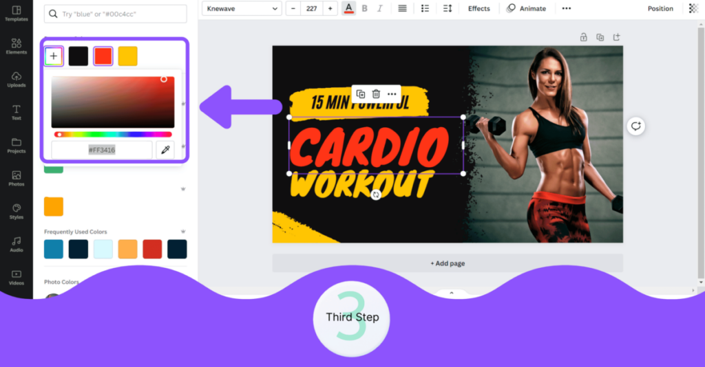
Ensure that your font color contrasts well with the background color to improve readability. Use light-colored fonts on dark backgrounds and vice versa. You can use Canva's color picker tool to experiment with different background and font colors.
2. Stick to a Limited Color Palette
Avoid using too many font colors in a design as it can look cluttered and confusing. Stick to a limited color palette that aligns with your brand or design concept. Canva provides a range of pre-selected color palettes to choose from or you can create your own.
3. Consider the Mood
Font color plays a significant role in setting the mood and evoking emotions in a design. Think about the message you want to convey and choose font colors accordingly. For example, warm colors like red and orange can create a sense of excitement, while cool colors like blue and green can convey tranquility.
4. Pair Complementary Colors
Pairing complementary colors can create a visually striking effect. Complementary colors are located opposite each other on the color wheel and provide a high contrast when used together. For example, you can pair blue with orange or yellow with purple. This combination can grab attention and make the text stand out.
5. Test for Accessibility
Ensure that your font color choices meet accessibility standards. Certain font color combinations can be difficult for people with color blindness or visual impairments to read. Use Canva's accessibility checker tool to ensure that your font colors have sufficient contrast and are accessible to all users.
6. Consider Branding
If you are creating designs for a brand, consider using the brand's colors for font choices to maintain consistency and reinforce brand identity. Use Canva's color codes feature to input the specific brand colors into your design.
7. Use Bold and Italics
When necessary, emphasize specific words or phrases by using bold or italic font styles. This can draw attention and make the text more visually appealing. However, use them sparingly and strategically to avoid overwhelming the design.
8. Avoid Using Pure Black or White
Avoid using pure black or white for font color choices as they can appear harsh or stark. Instead, opt for slightly off-black or off-white shades to create a more balanced and pleasant visual experience.
Summary
Choosing effective font colors in Canva involves considering contrast, limited color palettes, mood, complementary colors, accessibility, branding, and font styles. Experiment with different options and utilize Canva's tools and features to create visually stunning designs with the perfect font color choices.
Also Read This: Why Was My Fiverr Account Deactivated?
Common Mistakes to Avoid in Font Color Selection
Mistake #1: Poor Contrast
One of the most common mistakes in font color selection is choosing colors with poor contrast. When the contrast between the text color and the background color is low, it can make the text difficult to read, especially for people with visual impairments.
To avoid this mistake, it's important to ensure that there is sufficient contrast between the font color and the background color. Use a tool like the WCAG Contrast Checker to check the contrast ratio and ensure accessibility.
Mistake #2: Using Uncommon or Unreadable Colors
Another mistake is using uncommon or unreadable font colors. While it may be tempting to experiment with unique colors, it's important to remember that readability should always be a top priority.
Stick to standard font colors that are commonly seen and easily understandable. Avoid using overly bright colors, as they can strain the eyes. Also, be cautious of using similar colors for the font and background, as this can make the text blend in and become illegible.
Mistake #3: Ignoring Color Blindness
Many people have some form of color blindness, which can affect their ability to distinguish between certain colors. Ignoring color blindness can lead to font colors that are difficult to discern for a significant portion of your audience.
It is crucial to take color blindness into account by ensuring that the font color you choose is distinguishable from the background color, even for individuals with color vision deficiencies. Refer to color blindness simulation tools to test your font color against different types of color blindness.
Mistake #4: Overusing Stylistic Effects
While adding stylistic effects to your font can make it visually appealing, overusing them can result in poor readability. Text shadows, gradients, and reflections may look cool, but they can sometimes make the text hard to read, especially if the effects are too strong or the background color clashes with them.
Keep stylistic effects subtle and use them sparingly. Always prioritize clarity and legibility over fancy visual effects.
Mistake #5: Failing to Consider Context
Lastly, failing to consider the context in which the font will be used is a common mistake. The font color selection for a website may differ from that of a print advertisement or a presentation slide. Each context may have different requirements based on factors such as lighting conditions, screen resolutions, and the overall design.
Consider the background color, the font size, and the intended purpose of the text when choosing the font color. Experiment with different colors and test them in the specific context to determine the most suitable option.
Conclusion
Avoiding these common mistakes in font color selection can greatly enhance the readability and accessibility of your text. Always prioritize legibility and user experience when choosing font colors, and don't be afraid to test different options until you find the perfect fit for your specific context and audience.
Creating Consistency with Font Palette in Canva
Fonts play a crucial role in creating a consistent and visually appealing design. Canva, a popular graphic design tool, offers a wide range of font options to choose from. However, using a random mix of fonts can lead to a cluttered and unprofessional-looking design. In order to create consistency in your designs, it is important to establish a font palette and stick to it throughout your design process.
Why is a Font Palette Important?
A font palette provides a set of carefully selected fonts that complement each other and create harmony in your designs. It helps to maintain a cohesive look across different elements of your design, such as headings, subheadings, body text, and call-to-actions.
Here are a few reasons why establishing a font palette is important:
- Consistency: By using a limited set of fonts, you create a consistent visual identity for your brand or design. This consistency helps to establish recognition and builds trust with your audience.
- Clarity: When you use a consistent font palette, it enhances readability and comprehension. Different fonts have distinct characteristics, and using too many fonts can create confusion and distraction.
- Professionalism: A well-chosen font palette gives your design a professional and polished look. It shows attention to detail and an understanding of design principles.
Building a Font Palette
When building a font palette in Canva, consider the following steps:
- Identify your brand voice: Your font palette should align with your brand's personality and values. Are you aiming for a sophisticated, modern, or playful look? Determine the style that best fits your brand image.
- Limit your font choices: Select a maximum of three fonts for your palette. This helps to maintain consistency without overwhelming your design. Choose fonts from different categories, such as serif, sans-serif, or decorative.
- Establish hierarchy: Assign each font in your palette a specific role based on its characteristics. For example, one font can be used for headlines, another for body text, and the third for call-to-actions. This establishes a clear hierarchy and adds visual interest.
- Test readability: Always ensure that the fonts you choose are easy to read, especially for longer passages of text. Avoid using highly decorative fonts for body text, as they can be hard to read at smaller sizes.
Implementing the Font Palette
Once you have established your font palette, apply it consistently across all your designs in Canva. Canva allows you to save your font choices as part of your brand kit, making it easy to access and use them consistently.
Additionally, consider the following tips when implementing your font palette:
- Use font hierarchy: Stick to your established font roles and hierarchy to ensure a clear and organized design. Use larger font sizes for headings and subheadings, and smaller sizes for body text.
- Experiment with font pairing: If you have chosen multiple fonts for your palette, experiment with different combinations to find the best pairing. Canva also provides font pairing suggestions to help you make informed decisions.
- Consider contrast: Ensure that there is enough contrast between your font and background to maintain legibility. High contrast enhances readability and makes your design stand out.
In conclusion, creating a font palette in Canva is a crucial step towards establishing consistency in your designs. By carefully selecting and implementing a limited set of fonts, you can create a visually appealing and professional-looking design that reflects your brand identity.